Showing posts with label semiotics. Show all posts

10.12.14

Harvard Business School Students to collaborate with DY Works and Reliance Retail for hands-on programme

A team of students from the Harvard Business School will be working closely with DY Works and Reliance Retail India in January to understand cultural trends and consumer triggers in the Indian context. The experience is part of a required first-year course at Harvard Business School called FIELD, which stands for Field Immersion Experience for Leadership Development. DY Works is one of 156 FIELD Global Partners spanning 13 countries around the world. Together they will host more than 930 students in all.


“We are looking forward to this engagement. As a company that bases its work on culture and semiotic enquiry, this experience falls seamlessly into our vision of research”, said Alpana Parida, President DY Works.  “We are pleased to be working with Harvard Business School to provide students with a real-world learning experience in Mumbai, India. We feel certain that the students will gather insights here that they would never be able to glean from a classroom discussion alone.”

FIELD has three modules that run through the entire first year of the two- year MBA program. The first module focuses on developing individual leadership skills through team feedback and self-reflection. The second focuses on developing global intelligence by immersing them in a foreign country to develop a new product or service in the country for their Global Partner organization. The final module brings all the lessons together by challenging students to develop and launch their own micro-business as part of a small team back in Boston.

This collaboration includes India’s retail giant, Reliance Retail who will facilitate the engagement of the students with consumers and their purchase environments. DY Works executives have been working with the team remotely in the months leading up to their arrival in country. While here, they will pitch their ideas to the leadership team, conduct field research with consumers around Mumbai and present their final recommendations to management.

Harvard is quick to acknowledge that this important learning experience would not be possible without the Global Partners.

 “We are extremely grateful to DY Works, Reliance Retail and all the FIELD Global Partner organizations for all they do on behalf of our students,” said Professor Tony Mayo, the faculty head of FIELD. “The students benefit immeasurably from this experience and we hope the partner organizations do as well.”

27.5.14

Building Brand Modi

On 16th of May, 2014, when it became clear that Narendra Modi, known to the nation as the man behind the progress of Gujarat, has led the BJP to a historic victory (the party has won 282 seats itself, a first since Congress’ win in 1984), even the ones who had predicted the victory for him were surprised. No one could’ve anticipated such a landslide win. No one. Well, except for the think tank who strategized Modi’s campaign and made him more than just an authoritative political leader. They made him into a brand which resonates strength and a freshness which the voters thought should be made the representative of a new India.

Personalizing a political campaign is nothing new. Obama’s historic victory in the 2008 US presidential elections is a prime example. What was unique about Modi’s campaign is that not only it put forth Modi forward as an iconic leader but also built an image of him that is so great that it surpassed the reputation of the political party that he was a representative of. And the more interesting factor is that all of it was intended.

Creating a strong brand presence isn’t easy by itself. But creating a brand presence which is trying to break away from a tainted image is even harder. The BJP had employed the best of the best in concocting and applying their media strategy. Household names such as Piyush Pandey and Prashoon Joshi led the campaign. They brought in well known agencies which developed themes and concepts which aided the one specific message that the campaign was trying to communicate to the voters. Growth and development.

By decoding the colours Saffron and White which consequentially transcendent into strength and purity, the campaign through its visuals gave out an impression of stability.

The message was clear. But what separated it from rest of the political campaigns so far is the unique way in which the same message was delivered to different segments of the voters by customizing the approaches. The youth had been specifically targeted. The reason being that they make up for largest no. of voters in the country. With exhaustive social media campaigns with hashtags such as ‘#NaMo’ and taglines like ‘Ab ki baar, Modi Sarkaar’ which went viral it was ensured that the voters are not only aware of Modi as a brand but also they’re interacting and engaging themselves in the digital environment with the brand’s presence which later inevitably transfers itself to the outside world.
This was only just a small part. Corporate leaders backed Modi, during his public addresses and this in turn translated into the hope of strategic and sustainable development. This particular campaign saw some commendable innovations in BTL promotional activities. With campaigns such as ‘Chai pe charche’ and etc. that particular segment of the voters who are by nature media ignorant were targeted. Places where the aggressive print ads, radio jingles and TVCs could not reach, trucks loaded with Modi posters, pre-recorded speeches, speakers and lights were sent out. Even 3D hologram images of Modi were distributed.

16.12.13

CREATE, EXPLORE & INTERPRET

An identity brings purpose to life. It defines ones existence and shapes the corresponding behavior. A person’s identity is his/her name that is accompanied by the specific characteristics possessed by the person. If we look at brands, there in we see the projection of its identity in form of a visual mark, which is popularly known as LOGO. Logo is a mark that represents the identity and behavior of the brand for which it is created. It’s the start point from where the world of brand personality originates.


Each brand has its own category premises in which it breathes and a core brand essence that acts as a soul. They are living beings in their own way. These brands affect numerous lives. Thus, it should be unique, memorable and relevant to its context. With this the challenge is to adhere to category codes but create differentiation that can lend some unique character to it. This pinch of uniqueness should help it to get registered in the mind of the consumer and also prompt quick recall.
Logo creation is one of the important aspects in design industry. If we think in practical frame then we may put across this statement that the logos are created by integrating visuals/symbols with typography. Wikipedia/popular sources defines logo as a graphic mark or emblem commonly used by commercial enterprises, organizations and even individuals to aid and promote instant public recognition. Though it belongs to the design domain, logos have crucial implications on human psychology and business generation.
Let’s look at these examples and see how logos occupy visual memory space and surprise us at various instances.
Examples: 


20.11.13

Branding and Packaging in the Dairy Category: India vis-à-vis International markets

The role of advertising for fast moving consumer categories ends after creating awareness for a product. In today’s cluttered media space where advertisers are constantly fighting for recall and top of mind awareness for their brands, whether the customer decides to buy a product of a certain brand or not, is more often than not decided on the aisles of the modern retail store or the local kirana store where she actually gets to see, touch and feel the product (packaging). And not at the time that she is exposed to the TV commercial or the press ad. Yet, packaging is still to get its due in the Indian scenario.The dairy category in India however has seen some interesting developments in recent times that are indicative of a new trend.

Branding in the dairy category in India

Over the years with the advent of modern retail, Indian brands have been focusing more than before on the packaging of their products so as to lure the fickle consumer.Dairy is one such category that has been seeing innovations in packaging. Amul and Nestle ruled the roost for a good many years. But with the arrival of other local, national, and international brands like Britannia, Mother Dairy, Go, Danone, Kraft, etc. the competition has stiffened. All brands are fighting for shelf and mind space. Blue and Yellow colours seem to be predominant in the category with most brands belonging to one or the other colour palette.  Internationally, the entire colour palette has been used for the dairy category. Primarily since dairy products there are available in a lot more formats, flavours and varieties than they are in India, the ingredient story is built on the pack very prominently. With the arrival of these newer formats in India, the pack graphic design scene will surely see changes here as well.

‘Go’ as a branding case study is interesting. When it came in with its new packaging, it immediately cut the clutter with its bold logotype and imagery in an otherwise sedate looking category. Interestingly, for its non-traditional dairy products like flavored yogurts and various cheese spreads among others, it went with the name ‘Go’ which is nothing but an extension of the mother brand ‘Gowardhan’. The brand architecture was designed smartly so that the new child brand gained from the equity of the mother brand but at the same time had a distinct identity of its own since it very clearly targeted a different consumer set than brand Gowardhan did.

19.11.13

Design Vacuum


 19th Nov 2013, The Financial Express - Brand Wagon

As you drive around any metro or even a small town in India, you see mushrooming buildings of steel and
glass framing an emerging skyline. These buildings are modern, cookie cutter boxes, with tons of glass and steel and are clones of any such edifices in the world—be it Dubai, London, Singapore or
New York.
Anyone who knows India knows of the dust and dirt on the streets. In that scenario, glass? The cleaning systems are rudimentary—and square feet after square feet of glass is difficult to keep clean.
The glass surfaces everywhere have begun to collect visible amounts of dust and dirt—and each building spends enormous resources on fighting this battle. And that is just the problem with some of the functional aspects.
The inspirations for architecture in India could have been many—from digging into the rich tapestry of architecture and design history of India, to the understanding of local materials that are both environment friendly and cost efficient, to an inquiry into Indian public spaces and the collective expressions in those. The starting points of inspiration are many.

India is a land of transposed design. Indeed, I believe this to be a theory true for most developing nations.
Progress means picking up designs from the developed nations of this world and super-imposing them on the developing nations—with little thought or attention to local contexts.
Why does this happen? Why has the power of design been consistently overlooked by developing nations in everything—from airports to large hydel dams, from consumer products to malls, from clothing to automobiles? There are no more than a handful of local insights or solutions.

In a country that is hot and humid— like India is, men’s collars turn black and grimy every day, detergents sell proverbial tons thanks to their ability to clean collars and yet in the shirt wearing history of modern India, there is no record of any innovation on the collar. It is not that this is a nation of people who lack the intellectual capital. Far from it. Nor a nation that does not show an entrepreneurial orientation to adopt
new ideas.


Again, far from it. Then why is design not part of the Indian consideration?
The answer lies in history. In 1657, an Elizabethan era of scientific inquiry, when the western world was inventing the pendulum clock and understanding the principles of probability—Aurangzeb, a particularly ruthless and regressive Mughal emperor was ascending the throne of India.
By 1757, when the spinning jenny was heralding the industrial revolution, changing the way people lived and worked and giving the first taste to capitalists of the profits to be enjoyed through industrial design, the seeds of belief in the power of design were sown. When the first cars and the Macadamization of roads were defining a new way of life, India fought and lost its first battle of independence, the Battle of Plassey, to the
East India Company, which quickly established the latter’s rule. The ammunition and ships they brought with them helped them establish a stronghold in the country. And the systematic plunder of India’s natural resources and the decimation of local enterprise began as even the most basic commodities such as salt and sugar began to be imported. This was also an era when imported fabrics from Manchester took over the local markets and local weavers and craftsmen began losing their livelihoods. This then, is the beginning of a super-imposition of external sensibilities and aesthetics on the local population. Local enterprise shriveled and toeing an imperialist line was mandatory for economic profit. The power of design was completely absent.
In another 100 years, by 1857, the zipper, the safety pin, the fax machine, fibre optics (yes, 1857!) and hydrogen fuel cells were all invented, while India fought and lost the second battle of independence—also called the Sepoy Mutiny depending on which side of the Himalayas you come from. It was importing everything finished and designed and was exporting everything raw and unprocessed. Every bit of value addition was done outside the country—and there was never an economic benefit of design that was demonstrated to the local population. Everything indigenous was slowly lost.

A decade after India gained independence, in 1957, India was trying tocatch up with the world. And it transposed development into India. The Indian Institute of Management, Ahmedabad— was modeled after Harvard Business School. The architect—Louis Kahn— designed what was perhaps his finest work, but with no integration of the Indian societal context in design. The management education in India needed to
understand the social context of sons inheriting family businesses and needed to enable them rather than
create managers for multinationals companies selling soaps and detergents and a well-segmented demographic. The Indian Institute of Technology was modeled after MIT, medical schools were set up and all indigenous forms of knowledge in medicine and sciences, to say nothing of the arts and crafts, were fading. The world had already tasted space travel, nuclear energy and computers and India was in a hurry to stay abreast with the world.


The same was true in case of large infrastructure projects such as hydel projects or big engineering projects. There was never a search or a debate about local micro solutions that maintained the local ecological balance and became a source of livelihood rather than uprooting the local population.
In this historically challenged world of transposed development, the Indian entrepreneur never learnt the fruits of design thinking and manifestation. The economic power of a new idea, service or product that met the local needs was generally not experienced. The luggage that needed to become a seat at the crowded railway station never got made.

This dependence on transposed thought extends to the word of branding as well. Not only is the product design cut and pasted outside the context, so is the brand, its positioning and its packaging.
Local studies in semiotics and mining of deep cultural insights to understand implications on design and brand creation is often not practiced in category after category.

When Amul decides to propagate the much vilified ghee, by saying one spoon a day is good for you or Cadbury identifies a place for chocolate as a mithai equivalent—the brands see a sudden explosion in the market place. It is my belief that a deep cultural connection is necessary for a successful
brand and product design to exploit the market potential to its fullest.

Alpana Parida is president of DY Works (erstwhile DMA Branding). The views expressed here are her own.


9.8.13

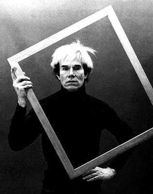
The Andy Warhol Experience

A few months ago a bunch of us, mostly newbie’s, were given the opportunity to attend a screening of a documentary on the life of Andy Warhol. It was at Good Earth and was followed by a 3course meal.

None of us really knew who Andy Warhol was; we were honestly going for the free food.

As soon as we entered Good Earth, an aromatic breeze swayed us towards the scented candles lying on the counter. But we resisted and headed towards the cafeteria where the screening was held. We were seated just when the documentary was about to start.

We went on to enjoy a suave evening spent with connoisseurs of art and design, amazing food and ambiance. The event gave us the perfect opportunity to get accustomed with newer facets of design, says Sangeet.

So who was Andy Warhol?


10.4.13

Frooti gears to move to its next phase of growth with new commercial

The Economic Times, Wednesday, 03 April 2013
 
For those who have seen it carefully, the new brand campaign for Frooti reveals a subtle shift. It shows the newly signed brand ambassador Shahrukh Khan glugging the mango drink from a PET bottle, rather than a tetra pack, which is no longer as respected as it used to be and which also made Frooti most instantly identifiable when it was launched for the first time.


The Rs 1500 crore brand is ready to move to its next phase of growth, in a world filled with competitors like Coca-Cola's Maaza and PepsiCo's Slice on the one hand and carbonated beverages on the other. For instance getting on board one of the most recognised faces is being touted as the game changer for the 27-year old homegrown brand considering it has never resorted to getting a celebrity endorser before.

Feels marketing consultant Harish Bijoor, "Frooti's big strength is the fact that it has been around for donkey's years. It has become generic to the category altogether." This is a strength and a weakness as well, in his view, which the brand has to manage swiftly and carefully.

Nadia Chauhan Kurup, MD and CMO, Parle Agro agrees that the biggest challenge has been to get the magic back for a brand as old as Frooti. It's trying to combat some part of that challenge by getting the recognised face of Shahrukh Khan onboard. Frooti seems to be the last in the race to join the celeb-band wagon: the other players in the mango beverage space already have their ambassadors: Maaza features the pranks of Imran Khan and Parineeti Chopra while Slice has Katrina Kaif 's sensuous Aam Sutra moves.

The recent commercial shows a bunch of kids in a football field watching Shahrukh Khan gulping Frooti. He looks around when he is done and what he sees is a bunch of young adults whose longing for Frooti apparently has them lapse into a childlike state of wonder. He simply asks them 'what?' which snaps their reverie.

Shares Sajan Raj Kurup, founder and creative chairman, Creativeland Asia, "One of the key tasks in the brief was to capture the feel of relishing a bottle of Frooti and up the appetite quotient for the beverage." Even as the initial thoughts read more like 'oh no not again', Kurup wanted to create drool value purely through human emotions, reactions and expressions. Prakash Varma of Nirvana Films has directed the film. The team was very clear on how to use the celeb power of Khan without letting the brand get ambushed.

Shares Nadia Chauhan Kurup, "The campaign is breaking not just the category clutter or the advertising clutter, but it is even breaking the celebrity endorsement clutter." It is not often that SRK has been used in such a way where the only dialogue he gets to mouth is 'what?'" she says. When asked if he charged any lesser because he was made to talk less, she grins and shares how she wishes that it worked like that in which case "we would have just kept him silent." According to Satbir Singh, managing partner & chief creative officer, Havas Worldwide, "The usually talkative SRK quietly polishing off a bottle of Frooti makes it stick. Most agency and marketing teams would have him mouth a hundred words in praise of the brand." Studies have shown that culturally, kids and women prefer mango drinks just as the core audience for cola/ caffeine drinks (Mountain Dew, Red Bull etc) is men.

 Alpana Parida, president, DY Works feels that this campaign reaches out to all ages and appeals to the child in men, to kids themselves and certainly the mothers who are both shoppers and consumers.It lifts the humble Frooti from a kiddie realm and will probably do more for the brand than all its past campaigns put together. According to Jitender Dabas, head of strategic planning, McCann Worldgroup, "A mango drink is about the pleasure of consuming mango and with this campaign Frooti seems to be coming back to its core." But is this the new positioning or just a commercial, is what he would like to know.


Along with the brand film, the marketing plan includes outdoors, BTL, mall activation, visibility at retail outlets (POP) and strong digital presence. Interestingly the first leg of this campaign was launched on the social media and as per Kurup in less than a week, its total timeline deliveries amounted to 52 million. It managed to garner over 8 million twitter handles and a whopping count of 80,000 tweets. Frooti's YouTube channel views increased by 2.5 million and subscribers increased by 600%.

Even as the brand spends 40% more on it's marketing this year compared to the last, it will have to quickly address one of its biggest weak spots — its relatively feeble presence in the returnable glass bottle (RGB) space. The returnable glass bottle is at the top in the pecking order of the caste system of packaging of soft drinks followed by the PET bottle and then the tetra pack at the bottom-rung, shares Bijoor.

This has been a pain-point that the brand is trying to tackle on a war-footing. Agrees and shares Nadia Chauhan Kurup, "Currently there are only four manufacturing plants for RGB which would eventually go up to 20 plants. The bottle form is one of the highest penetrated packing formats and there is a huge market for it." The glass bottle format has been launched in a phased way in some markets and would be increased soon as manufacturing capacity increases.

And perhaps that's what it will take for Frooti, the oldest brand in the category, to give a better account of itself in a growing market for mango beverages.

Alpana Parida is President of DY Works, a leading brand strategy and design firm.
 

13.2.13

TURBANSCAPE


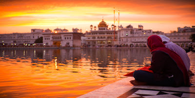
Paneer selling, paratha munching, lassi gulping, bhangra performing, romancing in sarso ke khet and  vrooming on tractors is a common picture that most of us derive of Punjab and Sikhs. Only while working on a Punjab related project did I stumble upon the fact that most of us living in the west, east or south of India have a very myopic vision about this sensitive state and its people. They sure do come across as a happy clan, who is fed well given their physique and can break into a folk song at a drop of their hat but the reality of their plight is deep rooted and is affected by layers of catastrophes that is hidden behind their cheerful yet gallant attitude to life.

It started with invasions of ancient empires of Persian, Greek and Afghan origin coupled with Alexander’s attempt to attack and the British Raj. This followed by the brutal division of the state during Partition, followed by yet another split of the state forming Haryana and Himachal Pradesh. Then came upon the worse bloody tragedy- Operation Bluestar, attacking a faiths most holiest shrine, remains a topic of great controversy and bitterness in many parts of society.  Whilst history has not been kind to the people of Punjab this fertile state still remains home to some of the world’s richest civilizations

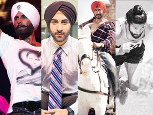
Today the Punjab we see and form an opinion of is influenced by the dream merchants of Yash Raj Studios and Adlabs. Munda, makhna, soni, rab, kudi, mauja, tussi, puttar, chak de every second Hindi film is peppered with Punjabi. It started with Raj and Simran flirting in mustard fields, dutifully applying mehendi, observing karva chauth and doing bhangra, this has led to a burst of Punjabification phenomena from Jab We Met, Veer Zara, Dil Bole Hadippa to Love Aaj Kal and Rocket Singh. Bollywood has become a site and carrier of celebration of shared Punjabi culture, with leading producers and directors having found something of a formula for success by including Punjabi cultural themes.The image of the mighty Sardar has been transformed in this new enterprise of Punjabi celebration: no longer presented a buffoon, the Singh is now a King, powerful, smart sexy and glamorous.

The stark paradox of the dark days in the life of Punjabi people and the Punjabi hybrid shown in movies today makes me me wonder what keeps this community in such high spirits and always ready for a ‘Khuth Ke Jhaphi’?

By
Priyanka Shah,
GM Strategy
DY Works

9.1.13

Fast And Furious: How Fastrack managed to play sex card in advertisings


Brand Equity, Wednesday, January 9th, 2013

Remember the character of Akira Rai played by the ebullient Anushka Sharma in the 2012 release Jab Tak Hain Jaan? Many of the films viewers conclude she was the brightest spark in an otherwise morose caper. A girl who believed in breaking up over the phone without shedding any tears, was looking for no strings attached sex while also being the wholesome girl next door. Sort of like the young women and men of Fastrack.

With racy ads and a product range that's very sharply youth focused, expanding from timepieces to sunglasses, bags and belts, it's built itself as an Indian youth icon of sorts, no 4 in Brand Equity's survey of Most Exciting Brands. And that in a relatively short time frame, even as former youth favourites with a bigger heritage like Flying Machine grapple with where they belong and how they need to get there.

Fastrack was known for bold product design but the audacious imagery is of a slightly more recent vintage. It was launched in 1998 as a sub-brand of Titan and was later spun off as an independent entity targeting the urban youth in 2005.

Ever since, the brand has added accessories like eye gear, bags, belts, wallets and wristbands and is betting big on the youth fashion space. "Very few new brands have succeeded in India — Fastrack is one of them. It has been the first to identify the 'Move On' generation and position to them," views Alpana Parida, president, DY Works, a marketing consultancy.

Edginess has been the key factor, according to Arun Iyer, national creative director, Lowe Lintas. He adds "one can't build an irreverent brand and be safe in the communication." Accordingly the tone of voice has been kept bold. Its advertising initially had Virat Kohli and Genelia D'Souza making mischief in various locations ranging from the elevator to the ATM to the airport counter.

Then they moved the action to the bedroom, and the parking area and explained 'why the world moved on' to typewriters and handbrakes. After a commercial ran into problems with TV channels, Fastrack quickly went online to drum up hype about this 'forbidden' film.

The final clip was rather innocuous: a girl taking her bra off while still wearing her t-shirt with the cheeky line '20% off can mean a lot'. And though it had a lot less skin on show than the average deo commercial, it made several people who would otherwise have watched the ad without batting an eyelid, eager voyeurs charged up to catch a glimpse of the 'film the channels didn't want us to see'.

The tone of the ads over the last few years has been mischievous, just the right side of risque. In early 2012, the brand used digital as the lead medium for the first time to launch an entire collection called TEES. It had a combination of provocative visuals and girls admonishing people for staring at their T..s.

The hostel campaign for bags also created a furore as it showed a girl sneaking out of a boys' hostel after a night with her lover. A sequel to the ad had the same girl groping hot male passengers in a metro train. The use of young stars and a reversal of roles (and rules) made for a counter-culture offering in an otherwise polite and frequently dreary Indian brand universe.

Says Gupta, "Whatever Fastrack has put out there has always been aspirational and young. But above all it's always been believable. This makes it easy for the youth to relate." Adds Iyer, "For a brand like this we have to be thinking ahead of the curve rather than going by what the youth may feel as being currently cool."

An insight learnt in this journey has been that while it talks to the youth, many people who are not necessarily in that age bracket are using Fastrack too. It's a sign that the country is getting younger not just in age but mindset. Realising the propensity of its core target audience for the digital medium, Fastrack has been present extensively on it and is spending way above the industry average. Elaborates Vineet Gupta, managing partner of 22feet, digital agency on the brand, "Over the years, we have used the medium to influence every aspect of the marketing funnel — from engaging with our audience on a daily basis to generating conversations and awareness, to even launching new collections and activations with digital playing the lead role."

While the synchronicity between communication, packaging and product design has created an amazingly robust brand in Parida's view, what can be heightened is the in-store experience. It was in 2009 that Fastrack had opened its own stores positioned as a complete accessories destination. Currently it has over 125 showrooms, along with a presence in multibrand outlets. According to Vinay Bhatia, customer care associate and senior vice president - marketing and loyalty, Shoppers , "We are its top retailer in the country.

It has been consistently doing a double digit growth rate (CAGR) for us in last few years." Across the Tier I and Tier II cities, the brand is faring well and affordable entry price points have helped. In Bhatia's view, Fastrack is way ahead of category competition within the areas it operates in.

While it is good to have a footprint in all the spaces that the youth are excited about, the marketing head of a fashion brand, on condition of anonymity, points that it may actually be playing on a sticky wicket. Since it is competing in multiple segments and with many players, Fastrack could define the competition as coming from the various players in each of these categories or it could choose to believe there is no single challenger. The tipping point, many feel, could come from its overtly sexy positioning, which has got it noticed and has created ample anticipation but may pose a limitation in the long run. Explains Anup Vishwanthan, executive vice president, Leo Burnett, "The brand's aspirational value, creates a non-serious and frivolous image, which could corner it into a box when it gets ready to take the next leap." Going forward they will have to bring in certain values that would give them the stature, he adds, since the flip side of the entire 'move on' imagery could position Fastrack as lacking in depth and being irresponsible.

For now Fastrack seems to be having a free run with its target segment eating out of its palms. Who knows where the next extension could be coming from: a diverse set of possibilities ranging from funky helmets to equally funky condoms. 


AlpanaParida is President of DY Works , a leading brand strategy and design firm.

4.1.13

The Branding Opportunity With Festivals

America has successfully turned each festival into a business opportunity. This Black Friday, the day after Thanksgiving, retail and online sales crossed USD 1 billion.  Total holiday sales in 2012 crossed USD 580 billion. The definition of holiday season according to the National Retail Federation is from November and December—61 days total. Holidays during this period include Thanksgiving, Christmas, Hanukkah, and Kwanzaa.The period generates additional 600,000 jobs. The holiday season accounts for 20-40% of sales across categories.

While India sees a significant spurt in sales during Diwali and other festivals, even without comparable data, it would be safe to say that the marketing opportunity for festival specific shopping behavior is under-leveraged compared to the US.

Decoding Christmas, we can see that the market has evolved around the encoded rituals of the festival. The ubiquitous Christmas carols are warm and cheerful and are playing in every store and street corner. The stores are warm and cozy havens with the smell of pine and cinnamon, adorned in colour coded Christmas festivities pull shoppers in. The very act of shopping is celebrated as an important ritual of the festival. Christmas has its own colours, sounds, smells and tastes. There is a strong sensorial cohesion in how it is marketed across the country – and increasingly across the world. The colours of Christmas alone create a huge set of merchandise – from decorations to apparel. The myth of Santa becomes larger than life with Santas at stores and street corners, ringing their bells and going Ho! Ho! Ho! Hollywood complies, with at least one Christmas film every year.
The spirit of Christmas is encapsulated in phrases such as “spreading goodwill and cheer” or it being "the season to be jolly" are all uplifting manifestations of Christmas. The Christmas tree, the chimney and stockings and the plate of cookies and a glass of milk for the weary Santa are all significant rituals in homes.The many motifs of Christmas such as the mistletoe, the snowflakes, the tree cutouts, the candy canes and the stars – result in a clear delineation of the codes and rituals of Christmas.

Apart from the design codes of Christmas that create a wealth of Christmas specific merchandize, the gifting ritual creates a huge market.
The idea of gifting for Christmas is strengthened in popular culture – cinema and TV, and supported by retailers through a host of initiatives. The gift merchandise is made available at all price points. It is possible for kids to gift every classmate or teacher with decent options available at $1 upwards. At the most common gift price points of $20 and $50, there is significant merchandise that is in store windows, catalogues and online mailers. Gifting is made easier with gift receipts – that do not reflect the value but facilitate exchange if required. Stores like Bloomingdales also create a catalog of gifts for those who have everything – selling experiences such as space travel or luxury yachts.


When I look at Diwali, I am struck by the paucity of marketable assets. What are the colours of Diwali? We do have the motifs of Diyas, Ganesh and Laxmi - but where is the fun in all of this? The material is dated and does not have a contemporary appeal. The idea of Diwali is not captured in a clear understandable phrase as the “spirit of Christmas”. Welcoming prosperity, dispelling darkness are individual interpretations but there seems to be little myth making around it, through advertising themes or popular culture content.

There is an opportunity to ‘brand’ Diwali. Capture its spirit, define its rituals, design its motifs and create a rich trove of assets – that can be used to propel behavior and create merchandize. Embedded in the Diwali story – is the story of homecoming, of reuniting with the family. This could become the day of Indian homecoming. Families could travel far and wide to be together. There could be a ritual designed to take care of the fact that their home will have Laxmi walk in – even if they have closed their doors and are at their family homes. This flow of Laxmi – as is evinced by the gambling tradition in some states – can become epitomized by gifting (Genuine gifting and not the Indian recycling of gifts). 

The motifs of Diwali could lend themselves to specific holiday merchandise – and could galvanize category after category. Likewise, other festivals

Thanks to the Chopras, Johars, and even the Bhansalis, KarvaChauth is already enshrined as the ultimate ‘Valentine’s day’ of India. We need to find the colours and motifs for it, and make gifting a strong tradition for the day. The seeds for this are already in the ritual. What other way to thank the wife for her devotion to the husband’s well being than giving her a special and priceless gift? This kind of delineation of the festival codes would build a strong brand with defined rituals.

Every festival has its own codes, the need is simply to find its essence, create its brand assets that have a pan Indian / pan demographic appeal and then create a collaborative brand. AkshayTrittiya was ‘built’ into a pan-Indian festival through the intervention of the World Gold Council and a few jewellery retailers.

 Industry bodies such as CII or FICCI can take the lead on this – in bringing manufacturers, retailers, branding firms, the hospitality industry and entertainment firms together in order to create our own brands of festivals. 
Branding of festivals could become a significant growth engine for the nation.


AlpanaParida is President of DY Works , a leading brand strategy and design firm. She can be reached at Alpana@dyworks.in

14.10.12

Indian homes: Shanti Nivas to Casa Grande


Alpana Parida,

Not just names, even the way Indians view their homes has changed. It's no longer the place where we let our masks slip but an avenue for showing off our international tastes and aspirations.

Homes used to be the very definition of our roots - and our current home was to be clearly distinguished from our 'ancestral home' or 'native place'. The women in the home were exalted as grih laxmis and this was a sanctified place that was not to be desecrated. Liquor was consumed outside, perhaps in the verandah or terrace and in vegetarian homes, the non-vegetarian indulgences - if any - were outside.

Homes were unsullied by the external world, they were havens that protected us not only from the elements but from the sullying effects of alien cultures. They were also places where we could let our masks slip. We spoke in our mother tongue, ate with our hands from stainless steel thalis and threw mattresses on the floor for extra guests - who were both frequent and many. They were spaces that were shared with no concept of personal space.

Our homes were where we stored everything and threw nothing. Mismatched curtains and sofas, the totally inappropriate machine made carpet (woolen in Mumbai?) and the Eureka Forbes vacuum cleaner (bought but never used), to say nothing of the bric-a-brac in show cases, the souvenirs from foreign trips and the sundry kitsch that defied provenance;all jostled for space.

Our homes were called Shanti Nivas, Gauri Sadan, Upasana, Diwan Shree, Kanchenjunga, Usha Kiran, Sah Jeevan and such like. They rooted us and we built our lives around our homes. Kids grew up and left - but the homes remained, often sprawling, unmanageable properties - with the ageing parents who stayed on as caretakers of a home that no longer was suitable for their life stage. Selling the home was never an option.

So much has changed about the way we view our homes now. For starters - the names have undergone a total transformation. Now we have Palm Springs, Miami Vista, Silver Oak, Hamilton Court, Bellissimo and Casa Grande in not only the metros, but in smaller towns like Kochi, Vadodara and Ranchi. The real estate industry is selling maximized spaces with minimalistic dêcor. Pristine white leather sofas and wooden or Italian flooring have become de jure. Interior decorators have mushroomed and coordinated walls and curtains have become a necessity.

The homes themselves appear international. A cursory analysis of real estate advertising throws up properties with views - both the interior and the exterior, that could be anywhere in the world. There is little of India that you see. The lure is that of an international lifestyle with jacuzzis and swimming and/ or plunge pools, rain showers and fitted kitchens;the new world is the promise of an escape. Exemplified by the hiding of all ugly things - the functional - the wires, the flush tank, the switchboards - and keeping only the aesthetics.

In less than a generation, we are living international lives. Our homes are no longer the place where we celebrate our traditional lifestyles, the one refuge where we can be ourselves. They are places where we flaunt our international tastes and aspirations. Where no mismatched dêcor exists and our interiors are as much statements of style as our clothing is.

Our need for making the indulgent, the everyday is now a necessity: the occasional indulgences of the past have become a way of life today at so many levels. The entertainment - which used to be the eagerly awaited Chitrahaar, the Sunday movie and the few English serials have given way to a 24-hour bonanza of channels and programs. The rare dessert or soft drinks that were the highlights of festivals or weddings, reside in our refrigerators and have inundated the everyday - chocolate has become the daily meetha. From at most twothree pairs of shoes/chappals - we now have a countless array. There is nothing occasional about anything in our life anymore.

In such a scenario - the occasional foreign trip, the stay at the luxury hotel or resort are no longer sufficient as rare indulgences. We want the experience everyday, just as we want 24x7 entertainment every day. We want our homes to become like the luxurious and sanitized world of hotels.

The aspiration of the foreign was always a promise of a better world. From hankering for brands/products that visiting relatives would bring in, we have tasted the foreign shores ourselves. We no longer are the recipients of others' largesse. We travel from Pattaya to Patagonia and eat pasta and paella. We shop abroad and take gifts to the same relatives who had brought us the coveted Yardley perfume and the microwaveable popcorn. We tell them to not bring anything because "Now you get everything in India".

In this taking of control of our aspirations, is the key to how we look at homes today. We are no longer content with morsels of the good life. We seek it and acquire it. The rise of the new "gated communities" is due to the fact that they create a bubble, a haven that we can escape to. It is the formation of a community where we belong, we trust and we celebrate.

The discourse of homes today is that they are as symbolic of an "escape from" as they are of an "escape to". They are as much a seeking of an international, luxury experiences as they are of escaping the current breakdown of communities.


Alpana Parida is President of DY Works (alpana@dyworks. in), a leading brand strategy and design firm. The article has inputs from Snehasis Bose, Senior VP, strategy

29.6.12

The big deal about ‘Trust at first sight’ - PART I

When I started my research about this topic, most people gave me a matter of fact reasoning – “trust is earned”, “bharosa to barson mein banta hai” and similar blah... But if trust was only so much about long term relations, why do we end up trusting (almost) random people with life’s important decisions - the friend’s mother you were able to pour heart out to, that broker who was able to convince you to buy a bigger house or the fund manager who managed to increase your confidence in a risky investment option, or for everyone who had an arranged marriage - the guy/girl you met once and decided to get married to…Huh! Now how does that happen??

So dear readers, in the next few lines/paragraphs/pages(!) I would try to scrape off the tip of the iceberg called ‘trust’ and our mysterious abilities to indulge into it almost instantly when encountered with suitable triggers. However, let me note here that there’s hardly any formula that you might find here, infact it might raise more questions instead…but that’s where the meat lies!

So coming back, it’s obviously much easier to build trust with the luxury of time, when you get multiple opportunities in various situations, like the colleague I met on my first day of job, the guys/girls some of you would have dated before getting married. But there are many more situations, where one has to make up one’s mind almost instantly or create an instant impression – like an arranged marriage meeting, a job interview, a new client meeting, a new bank/financial company experience or the simplest – the 3 seconds window that a new brand gets sitting on the super market shelf!

Our mind stores information in clusters. Like an automated sorter, we unconsciously make patterns from everything that we experience through life. Every new experience/thing/instance gets decoded by our contextual selves and gets associated with one of the numerous existing patterns in our head.

Trust works the same way too, through our lives we learn to trust many people, places, things, products, brands, symbols etc. Based on these we create patterns of trust which act like a filter to asses each new experience we get into. While the filter aims at finding intrinsic values which can be tested in the long term, it also looks for physical attributes which usually give us the confidence to trust almost instantly.

Now imagine getting hold on the general patterns of this ‘trustable physicality’ which if incorporated in new stuff gives a chance of creating instant trust! Now, that’ll be cool!
In order to find this eluding answer, I started a semiotic decoding of people/places/things that we already trust, which did take me to some interesting spaces.

Starting with people, the one person who everyone trusts?

Simple answer: Mother

Before I say further, imagine an image of a mother, NOT necessarily your mother, someone imaginary but one who could completely epitomize trust & reliability.

…….(Yeah. I really want you to imagine)

Do you see a middle aged woman, healthy-ly curvy/ slightly plump, dressed in a sari/salwar kameez, accessorized with gold bangles, earrings or a neck chain, a round red bindi and comfortable footwear.
Having tried this on 20 people, I got this characterization 90% of the time!

Besides uncovering our stereotypical selves (thanks to Nirupa Roys & Tulsis of the world), this points towards 3 key physical aspects:
  1. The healthy plumpness
  2. The age
  3. The Traditional but simple attire
Let’s see what is it about them that helps exuberate trust:

The Healthy Plumpness: A loving, trustable mother can never be thin or even tending towards it. The plumpness is like the mark, a reminder of her having gone through the maternal bliss of pregnancy, the union of the child & the bearer, something so pure and complete that it just cannot be shed away as extra pounds. It also symbolizes the inherent softness and completeness of her very role. Skinny or angular features give a certain edginess/cunning-ness to the character which is completely out of place for a mother in our culture.

Further, circles/spheres are also the most used symbols of denoting complete-ness and stability. There’s must be a reason why there’s a ‘Circle of trust’ & not ‘square of trust’!

Now put this learning into the hard corporate world. Remember the most trusted company of India. Now remember its identity:

A rounded identity outline with smoothed lines and chunky plump font. Spot on!

Check identities of other institutes where trust is a key requirement - like banks as they deal with money - they would follow similar style:
The age: The trustable mother needs to have some years of experience behind her. A sense of oldness cues knowledge, experience and hence credibility. Just the pretense of age-old-ness can lend a hell lot of trust.

A 16 yr old Mumbai real estate builder has a logo which makes it look like 100 yrs old brand… see it to believe it!

Other similar examples of brands which exhibit ‘age old experience’ as a key design thought:

The Traditional simple attire: The traditional-ness of the attire takes us to an older, authentic, tried and tested space where one could just trust without any skepticism, where one can be a child again and get rid of the responsibilities & stress of current life. Add to it the simple-ness of the attire, it cues
uncomplicating life by moving back to the roots where the world is pure and unadulterated.

Many brands use this value of simple authenticity that can instantly connect with the consumer:


So that’s about mommy dear, but does this define the world of trust?, Hell no! Remember the scraping of the iceberg….well we’ve just started….more on this in Part II.

By Runjhun Pacholi
AGM – Strategy
DY Works

16.4.12

SEMIOTICS OF THE BINDU: ONE FULL CIRCLE

Bindu. One could argue that an article, especially one on semiotics, should probably not begin with a dot. However the 'bindu' is no full stop. Yes! It is simple but it is profound. It is as superficial as an embellishment but also as inherent as the soul. It is self contained, yet diverse. It is exactly why I thought the analysis of this mark, taken so for granted in a country inundated with culture, would make for an interesting ‘point’on semiotics as well as a fascinating analogy with brands.

In India the bindu is omnipresent - whether it be a chandra bindu in the devnagari script or a tikka on the forehead. Something as simple as a dot takes different meanings with its multiple shapes, sizes and colors. For instance, in an Indian soap opera the slightest variation of the bindu defines the deadliness of the vamp. It subliminally changes people’s perceptions of good and bad. So in the context of brands, could one say that what the bindu does to the woman is what a logo does to a brand? The answer is yes, if you look at it as superficially as an embellishment. The answer has more layers as one explores the different layers associated with this deep-rooted symbol.

My first realization of the 'essence' of the Bindu was as a painting by French based, Indian painter, S.H.Raza titled 'Ma Laut Ke Aunga Toh Kya Launga' (Mother when I return, what should I bring you?). As an audience of age 8, what appeared as a black circle, evolved (with what I'd like to believe was my evolved sensibility) to take multitude forms. It formed a whole. A solid black circle encompassed half the canvas. Was it the womb of a pregnant woman? Or was it the symbol of the Bindu that one immediately associated with a quintessential Indian Mother? It was the containment of energy, the central point of emergence and a unit that preceded life. Raza himself calls the Bindu the 'seed' bearing the potential of all life. He says 'Bindu Ki Anant Sambhavnaye' (The multiple forms of the Bindu). It is through the eyes of a painter that I noticed the multiple dimensions of the Bindu.


It was the mere influence of the Bindu that gave the heavily French influenced painter an Indian soul. It gave the Indian audience a reason to believe in him and created an immediate emotional connect. Beyond the top layer of the painting, I began to see what Anjolie Ela Menon calls 'Pentimento', and M.F. Husain called 'birthmarks' - the lines still visible under the top layer of paint. It is what is visible but still absent. It contributes to the end product but deliberately takes a back seat. What earlier the layman would call marks that the artist forgot to cover up actually form the complete picture -a picture that fetches millions of dollars today.

So before I digress from semiotics- into my evident passion for art, you may ask what has the bindu to do with brands? At DY Works it all came back 'full circle' - pun intended! I realized its how we look at brands. It’s a simple way to build and envisage million dollar brands. What we call the brand seed gives the brand an essence; just like the bindu does to the various canvases, foreheads and scripts it prevails in. It can change the origin story of a painter, it can change the perception from positive to negative and vice versa, it can even change the way you pronounce a word in various languages.

And what is the reference to pentimento to do with all this? Semiotics is our pentimento at DY Works. It forms an integral part of the process, explicit enough to be noticed but subtle enough to take the back seat. It is what differentiates one from the other, it is the inherent core that builds the brand and lends immense character. It is not just about glossy color palettes, fancy fonts and what the layman would assume is a brand - the logo. It adds layers to the brand, making it identifiable, acceptable and rooted within cultures.

In Hinduism, the bindu is believed to be the point where energy exits the body. It contains and preserves this energy. It provides focus, aids concentration and balances temperament. Similar to the shape of zero, the original form of the bindu is an underrated geometric shape that provides a 360-degree view as a third eye. It is grossly underrated but very easily adds value. Can a brand do that? In my opinion it should. And for those semiotic geeks who have not had enough – I will try and be 'semiotically correct' by tying the close of the article with the beginning. With a 'Bindu'.

Contributed by
Udit Bhambri
AGM - Marketing
DY Works